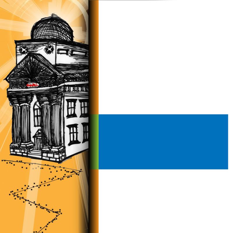
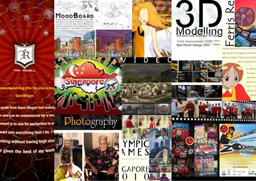
Today the last day of the block for both Professional Communication for Design and Visual Presentation. It was good that PComD ended earlier cause VPres take more time to reach the stage of satisfaction. Well if you are unaware about VPres, it is basically a module that train you in designing to let still images speak for itself and to be much more professional in visual outlook while presenting to client. I believe perfectionist attitude also take into concern where our product can be presentable.
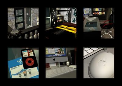
Exercise 1 - Dream Room (Framing)
While learning about the beauty of a perfect nice cut, I managed to gain a new skill and that is to cut difficult edges especially corners. By plotting marks from one point to another, it actually allowed me to slide my pen knife across easily by reducing accidental cuts which may destroy my work. The most important factor I learnt is about measurement. Detailed work helps me to save time by producing accurate cuts. Six images were mounted in between it with black border that create contrast and the images selected were from the same room.
Exercise 2 - Topsy-Turvy (Sorry No Visual)
The three forms were created by different types of papers. The three selected papers are suitable for packaging as it has an acceptable thickness which is able to cover the sides of the box. On top of that it is easy to bend the papers. The final product stands out really well because the colours chosen are of a lighter tone and it makes it easy to see the unique outline of the surface. Furthermore, the colour represents sunshine, is often associated with joy, happiness and energy. In terms of design principles, it symbolises harmony, repetition and unity.
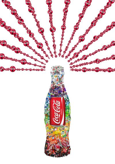
Exercise 3 - Coca-Cola Family (Collage)
My inspiration was derived from the wide variety of drinks produced by the Coca- cola family. With the relation of all of the drinks being linked to the Coca- cola company, it was easier for me to work with colour composition. The overview of the collected images, form an iconic Coca-Cola bottle with the explosion of the Coca-Cola logo, which symbolises strength, power and goodness. As for the iconic bottle that is filled with products of Coca-cola in rainbow gradient, it represents movements of happiness and refreshment. Furthermore, the composition of balance helps to create interest and emphasis to the centre that shows harmony of unity.
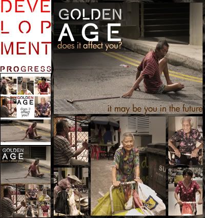
Exercise 4 - Golden Age Poster
The theme of Golden Age is to remind the youngsters to care and appreciate the elderly. Working on this poster made me realised the importance of composition framing. Observing the poster, you will see the combination of rule of third and line of symmetry. In addition, the colour treatment was desaturated and heavily filtered in sepia mood to incorporate the vision of third age. The main reason for this is to put across the message that the elderly see lesser vivid colours and I want my audience to be in their shoes when viewing this poster.
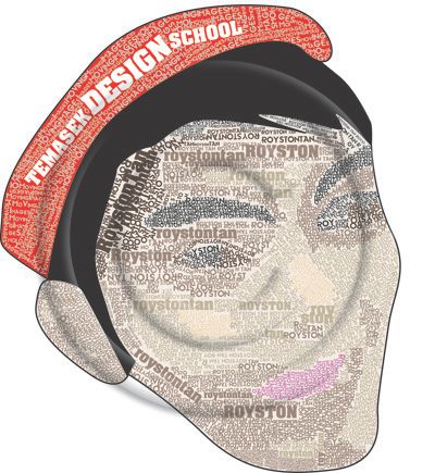
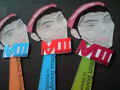
Assignment 1 - The Director's Lot (Typography featuring Royston Tan)
The purpose of this bookmark is to promote Temasek Design School, the course Moving Images in particular. The concept when creating these bookmarks is to be useful and creative. A Magnet is used to gauge which line you stop at and the magnifying sheet is catered for the third age to promote lifelong learning. The overall concept is to show determination which can be related to a film makers who tries to create wonders through a film. Emphasis is placed on the typography of Royston Tan's face which represents repetition of texts and harmony within the headings. Choices of colours make a contrast of different content and purpose.
<
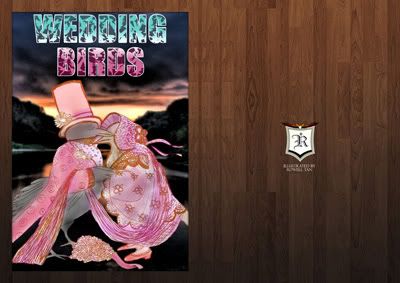
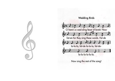
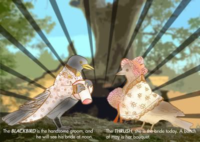
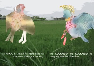
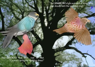
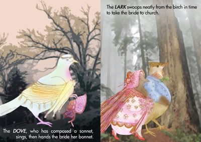
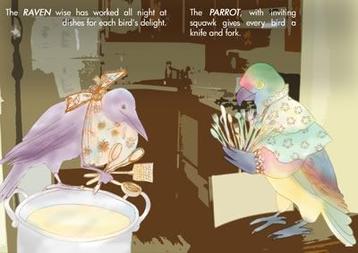
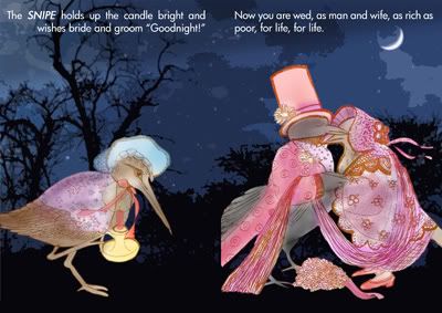
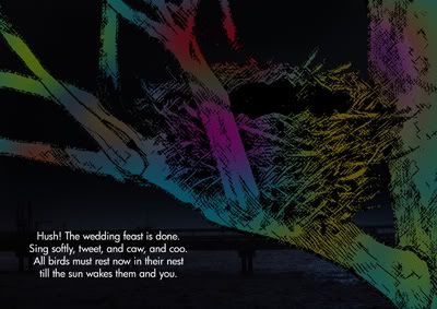
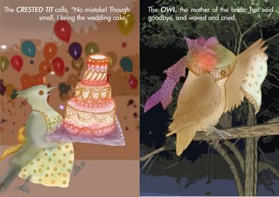
Assignment 2 - Wedding Birds (Book consist of 20 pages)
The concept of the book was an inspiration from a traditional German song with English words by Naomi Lewis. With the title as “Wedding Birds”, it was illustrated according to own creativity and imagination. From the events that happened in the book, you will get to know the different types of birds and the colours chosen page to page symbolises a day to night cycle of the different environmental mood. This way, it represents movement, contrast, process and unity. Furthermore, there are some detailed works done using basic design elements to create emphasis for the content.